
On this page
frontend utilities
introduction
dframework ships a complete utility layer for styling and dom interaction. utility classes are generated at compile time. no runtime css in js. frontend functions are available globally in every page script and component.
button classes
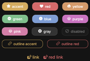
you can use prestyled buttons by using the base class btn and then chaining a prefix class btn-* where * represents the button color.
| available colors | description |
|---|---|
.btn-accent |
accent colored button |
.btn-red |
soft red button |
.btn-yellow |
soft yellow button |
.btn-green |
soft green button |
.btn-blue |
soft blue button |
.btn-purple |
soft purple button |
.btn-pink |
soft pink button |
.btn-gray |
var(--container) colored button |
.btn-transparent |
transparent button (use for animation) |
responsive prefixes
any utility class can be prefixed with a viewport breakpoint. prefixed classes apply only when the viewport meets or exceeds the defined width.
| prefix | min-width |
|---|---|
sm: |
480px |
md: |
768px |
lg: |
1024px |
xl: |
1280px |
xxl: |
1536px |
ultra: |
1920px |
1<div class="flex-column md:flex-row g-1 md:g-2">...</div>
layout
positioning
| class | description |
|---|---|
.relative |
position: relative |
.fixed |
position: fixed |
.sticky |
position: sticky |
.absolute |
position: absolute |
.absolute-center |
absolute center via translate |
.absolute-x-center |
absolute horizontal center |
.absolute-y-center |
absolute vertical center |
.absolute-fill |
fill parent element absolutely |
.top-0 / .bottom-0 |
top: 0 / bottom: 0 |
.left-0 / .right-0 |
left: 0 / right: 0 |
.top-50 / .bottom-50 |
top: 50% / bottom: 50% |
.left-50 / .right-50 |
left: 50% / right: 50% |
.z-[0–auto] |
z-index: 0, 1, 2, 3, 4, 5, 10, 50, 100, auto |
grid
| class | description |
|---|---|
.grid-center |
centered grid |
.grid-2 |
2-column grid |
.grid-3 |
3-column grid |
.grid-4 |
4-column grid |
.grid-auto |
dense auto-flow grid |
flexbox
| class | description |
|---|---|
.flex-row |
flex-direction: row |
.flex-column |
flex-direction: column |
.flex-center |
center on both axes |
.flex-wrap |
flex-wrap: wrap |
.flex-1 |
flex: 1 1 0% |
.flex-auto |
flex: 1 1 auto |
.flex-none |
flex: none |
.justify-[start,end,center,between,around,evenly] |
main axis alignment |
.align-[start,end,center,baseline,stretch] |
cross axis alignment |
.self-[start,end,center,stretch,baseline] |
per item cross axis alignment |
spacing
values available for all spacing classes: 0, 025, 05, 075, 1, 125, 15, 175, 2 through 10 (integer steps). margin also accepts auto.
| prefix | applies to |
|---|---|
.p- |
all padding |
.px- |
horizontal padding |
.py- |
vertical padding |
.pt- / .pb- |
top / bottom padding |
.pl- / .pr- |
left / right padding |
.m- |
all margin |
.mx- |
horizontal margin |
.my- |
vertical margin |
.mt- / .mb- |
top / bottom margin |
.ml- / .mr- |
left / right margin |
.g- |
gap (no auto) |
sizing
| prefix | values |
|---|---|
.w- |
100vw, 5–100 (5 step), auto, min, max, fit |
.h- |
100svh, 5–100 (5 step), auto, min, max, fit |
.min-w- / .max-w- |
same as .w- |
.min-h- / .max-h- |
same as .h- |
typography
| class | description |
|---|---|
.fs-[01–10] |
font size from .1em to 10em in .1em steps |
.thin |
font-weight: 300 |
.bold |
font-weight: 700 |
.uppercase |
text-transform: uppercase |
.lowercase |
text-transform: lowercase |
.capitalize |
text-transform: capitalize |
.text-[left,center,right,justify,start,end] |
text alignment |
.text-vertical |
vertical writing mode |
.overflow-ellipsis |
truncate with ellipsis |
.line-clamp-[1–4] |
clamp to N lines with ellipsis |
appearance
| class | description |
|---|---|
.bdr-[0–2] |
border radius in .1em steps |
.bdr-circle |
border-radius: 50% |
.border-[s,m,l] |
all borders |
.border-[top,bottom,left,right,x,y]-[0,s,m,l] |
directional borders |
.bg-[color] |
background (container, accent, red, blue, green, …) |
.text-[color] |
text color (same values) |
.shadow-[s,m,l] |
box shadow |
.opacity-[0–1] |
opacity levels |
.invert |
filter: invert(1) |
interaction
| class | description |
|---|---|
.pointer |
cursor: pointer |
.no-events |
pointer-events: none |
.click-haptic-[small,med] |
scale-down effect on click |
.hover:bg-[color] |
background change on hover |
.hover:text-[color] |
text color change on hover |
.shadow-hover-[s,m,l] |
shadow change on hover |
transitions & animation
| class | description |
|---|---|
.tr-[01–1] |
transition duration from .1s to 1s |
.fade-[in,out] |
opacity transition |
.slide-in-[left,right,up,down] |
entry movement |
.slide-out-[left,right,up,down] |
exit movement |
.preload |
disables all transitions |
performance
these classes communicate rendering hints to the browser. apply them to elements with complex, frequently updated content.
| class | description |
|---|---|
.stable |
will-change: transform; contain: paint |
.self-contained |
contain: layout paint |
.isolated |
contain: strict |
.gpu |
transform: translateZ(0); will-change: transform, opacity |
dom functions
global functions available in all page scripts and components. these should be preferred over native browser apis. they return cleanup functions and integrate with dComponent's auto cleanup system.
selection
1select('.btn-primary') // querySelector shorthand2selectAll('.card') // querySelectorAll, returns a true array3select('.input', formElement) // scoped to a parent elementevents
1const cleanup = listen(button, 'click', handler);2cleanup(); // detach manually if needed3 4listenAll(selectAll('.btn'), 'click', handler);classes
1addClass(el, 'active')2removeClass(el, 'hidden')3toggleClass(el, 'open')4hasClass(el, 'disabled') // returns booleantiming
1await nextFrame(); // resolves after 2 raf cycles (safe for measuring after dom changes)2await sleep(300); // promise based delay
data functions
type checking
1isString(v) isNumber(v) isBoolean(v)2isArray(v) isObject(v) isFunction(v)3isEmpty(v) // true for "", [], {}, null, undefined4hasValue(v) // true if not empty, null, or undefinedarray utilities
1move(input, from, to) // move an item within an array or string2remove(input, index) // remove an item at index3replace(input, index, val) // replace an item at index4limit(input, max) // slice to a maximum length5uniquify(input) // remove duplicates from an array or string6 7asyncForEach(arr, fn) // serial async iteration (awaits each fn before continuing)extras
1random(1, 100) // inclusive integer random2uniqueId(8) // collision resistant unique id string3clipboard('text to copy') // write to system clipboard4formatTime(seconds) // returns "mm:ss"5formatDate(date, false) // returns "YYYY-MM-DD"6formatDate(date) // returns "YYYY-MM-DD HH:mm:ss"7localizeDate(date, false) // returns "YYYY-MM-DD" in the user's timezone8localizeDate(date) // returns "YYYY-MM-DD HH:mm:ss" in the user's timezone9distance(a, b) // levenshtein or jaccard distance between two strings10 11Storage.get('key') // typed localStorage wrapper12Storage.set('key', value)13Storage.remove('key')14Storage.clear()
notify & modal
notify
displays a non blocking toast notification. auto dismisses after the timer expires.
1notify('profile updated');2notify('upload failed — please try again', 6000); // custom duration in mspass a setup callback to attach interaction to notification elements. use .listen() inside the callback for automatic cleanup when the notification closes:
1notify('<button class="undo-btn">undo</button>', 5000, (n) => {2 n.listen(n.querySelector('.undo-btn'), 'click', () => {3 undoLastAction();4 n.close();5 });6});7 8// omit the timer to control close timing from the callback9notify('<button class="undo-btn">undo</button>', (n) => {10 n.listen(n.querySelector('.undo-btn'), 'click', () => n.close());11});modal
displays a floating modal. handles its opening animation and removes itself from the dom after closing.
1modal('<h2>success</h2><p>your order has been placed.</p>');pass a setup callback for interactive modals. use .listen() for automatic cleanup:
1modal(`2 <h2>delete post</h2>3 <p>this action cannot be undone.</p>4 <button class="btn-danger confirm">delete</button>5 <button class="btn cancel">cancel</button>6`, (m) => {7 m.listen(m.querySelector('.confirm'), 'click', async () => {8 await fetch(`/posts/${postId}`, { method: 'DELETE' });9 m.close();10 notify('post deleted');11 });12 13 m.listen(m.querySelector('.cancel'), 'click', () => m.close());14});